The second piece in my food photography discussion will look at white versus dark backgrounds, and how you can change the entire palette and dynamic of your photograph just by hanging up some black fabric. As far as food photography goes, this is a simple as it gets - but the results are ever so dramatic. What's your favourite food photography tip? Let me know in a comment!
When I look at my first photos on this blog, I physically cringe. They are out of focus, badly styled, horribly edited. The white balance is off, the fabric choices are all wrong, and the special effects are nauseating. But they are there to tell a story, to illustrate how far we can get if we just work at it. If we take classes, refuse to give up, and practice, practice, practice.
There are days when I wish blogging could be easier; that I could just sit down at the computer and bang out a perfectly succinct, flowing, elegant 500-word post which would tug at the heart strings as well as educate. That I could take a camera and within 10 minutes, produce a series of well-crafted, beautifully styled photos that would be properly exposed and be able to tell a story. That I could just do it all without thinking, without trying, without working so hard.
But instead, most days blogging feels like a game of tug-of-war, a drawn-out effort to open a jam jar with a stuck lid, an endless marathon while the ground is falling away from you. In other words, it's feels like a lot of hard work - and that's exactly what it is.
Most days, it feels like there are no shortcuts. No easy solutions. No simple ways to get things done.
And then you discover something small that just changes your life.
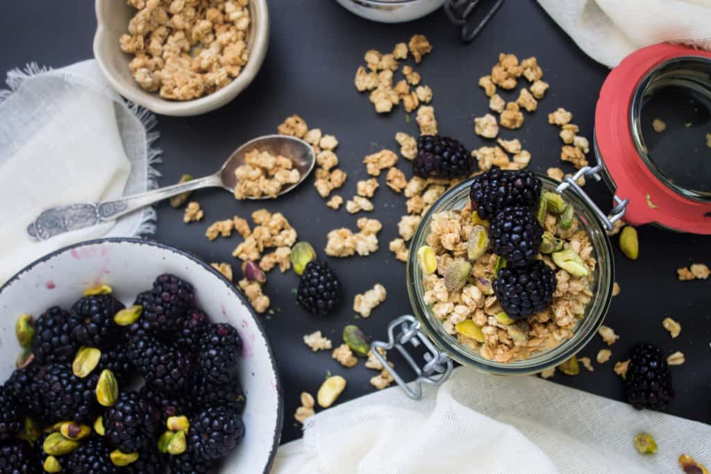
For me, with blogging, that small discovery was the effect of a dark background.
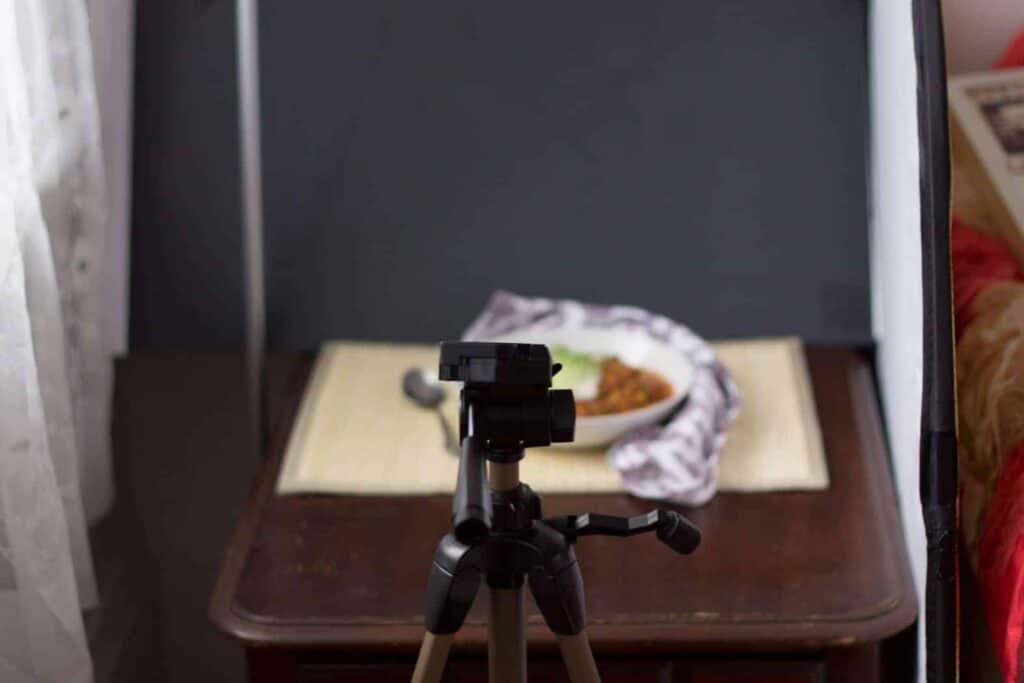
It all started with a food photography course I took with the incredible Eva from Adventures in Cooking. One of the very first things Eva has taught us, in between the shutter speed and aperture discussions, was the effect that dark and light reflectors can have on our work.
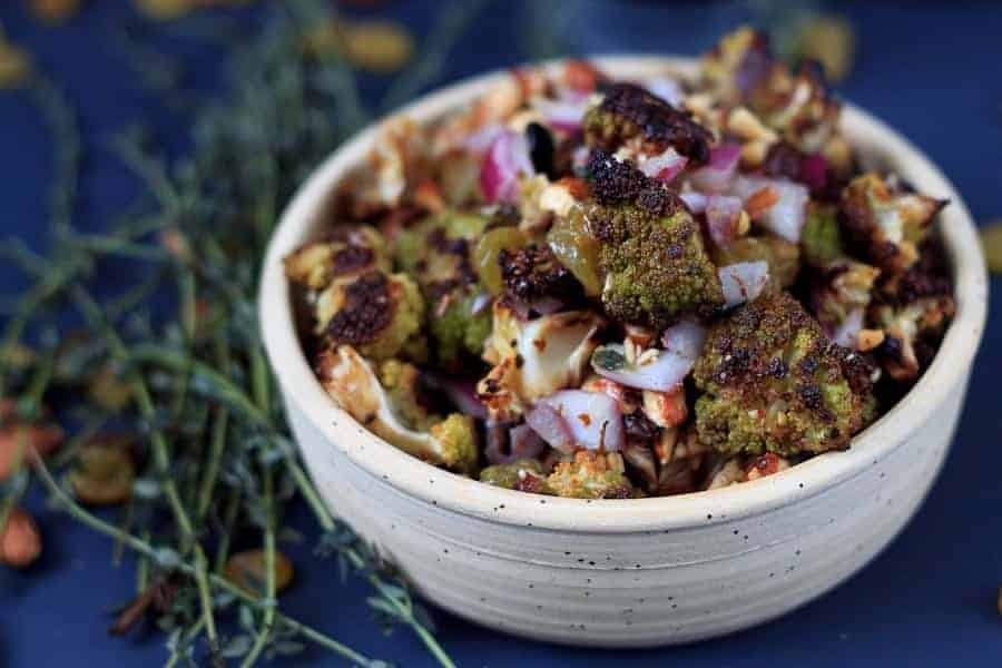
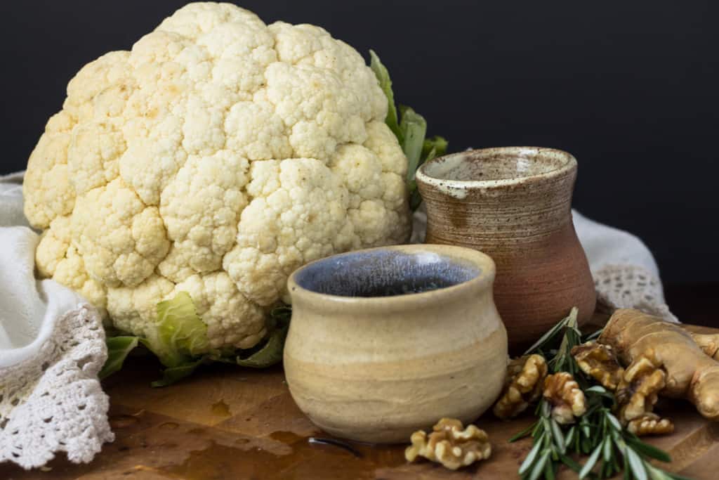
The very same day, I went out to Dollarama and bought two black and two white poster boards (2 for a $1 - it doesn't get much cheaper than that). I used them the very next day to style my green cauliflower salad.
And to photograph my cat, of course.
 |
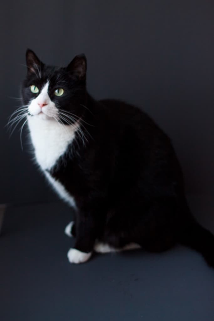 |
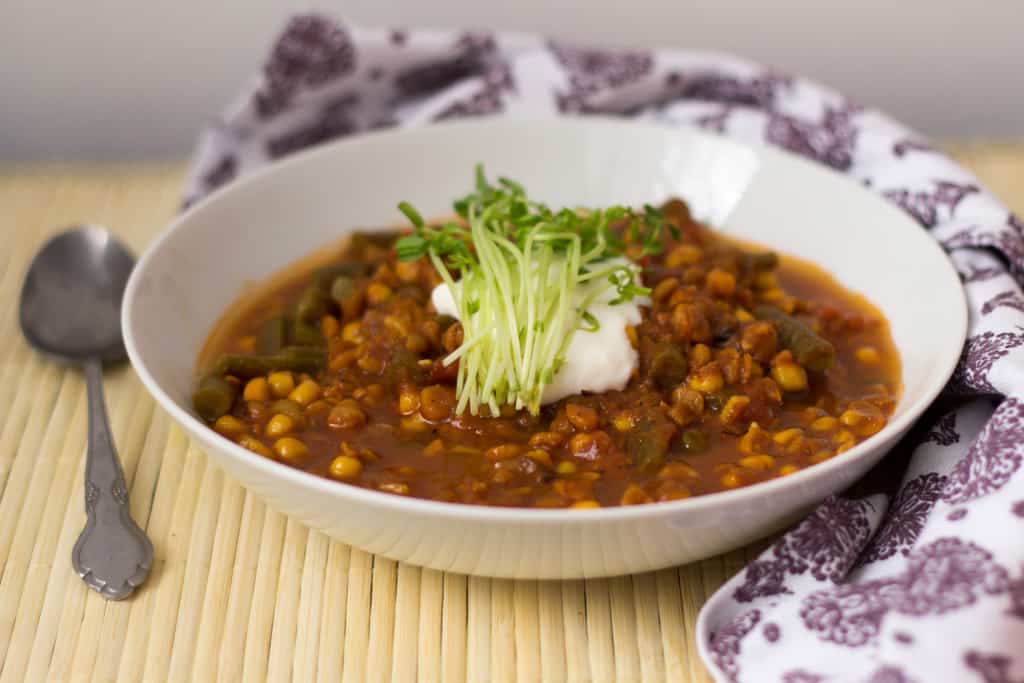
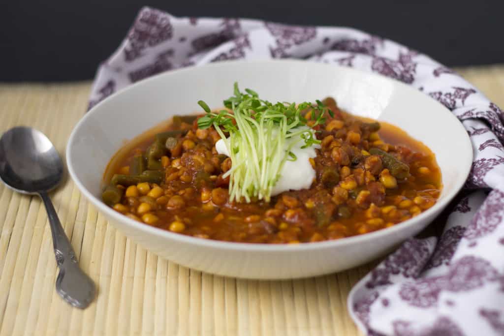
The results were breathtaking. I couldn't believe what a difference the dark poster board made, how it made the food pop, how it made the photos so much more dramatic.
 |
 |
I have since upgraded to black vinyl, which is actually much closer to a true black rather than the blue of the Dollarama poster boards. It's also easier to poster and to clean. But either option works.
 |
 |
 Even if the black background isn't the focal point, sometimes the effect it creates just by not reflecting additional light on the other items is enough to make it worthwhile.
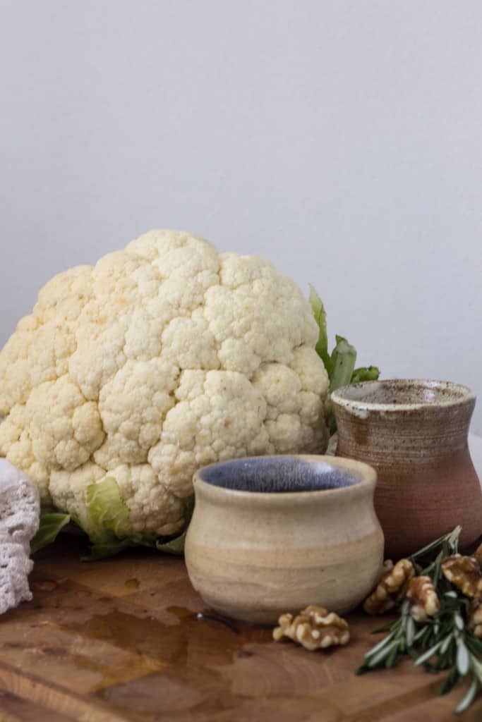
However, it isn't always effective - in some photos, a dark background made everything look much too dark. And if you're aiming for a dreamy, romantic look, a stark black background can actually seem too harsh at times.
 So if you want to make your subjects pop, try hanging black fabric or black poster board in the background. You'll be surprised with how much drama it can add to your work! But don't use this as a catch-all solution; try styling your photos with both dark and white backgrounds, and see what you like best.
After all, the beauty of blogging is that it allows us to experiment.


Berta says
Yes, yes, yes! Blogging is hard work, and anyone, who thinks that it's an easy way to earn some money clearly hasn't tried it!
What a great tip! For some reason, I tend to steer away from dark backgrounds, but as you pointed out, some photos are just not the same without it.
As for a photography tip(s), they are this:
1. Buy plain board, preferably two - a dark and a light one.
2. Arrange, arrange, arrange! Don't just take a photo of a plate, but make a scene out of it 😉
kseniaprints says
Honestly, I also always steered clear of black backgrounds because I wanted my photos to have a light and airy atmosphere... But I found that since I started using them, I'm able to get my objects so much crisper, and they actually help make them stand out even more so than a white background, because somehow they allow the natural white tones that are in your objects to shine through (if that makes any sense). Honestly, even if the black board isn't visible, I often still keep it there anyway to stop the white wall from 'stealing' my light.
And I love your tips! The arrangement part is so true. I talked a bit about how I arrange things in my first photography post (https://immigrantstable.com/2015/01/16/food-photography-trick-1-timing/). I like to try and tell a story with food, if at all possible.
Berta says
I remember that post! It was very helpful in helping me decide what and how to arrange; my initial shots were the strangest combination of messy-in-the-process-kind-of-shots and attempts at an impressive serving suggestion 🙂
kseniaprints says
Mine were exactly the same!
Kathryn says
I use the 2 for $1 white & black boards, too. Also coloured ones to play around with. Thanks.
kseniaprints says
Which colours do you use? I bought dark blue. gold and silver, but haven't used anything except b&w....
Terry says
WOW! It never occurred to me about dark backgrounds before!
But of course, it should have been obvious; the contrast generates a sudden change in the electrochemistry occurring behind the retina, and this suddenness "instantly" has an emotional result in the enhanced visual experience. It is this engagement of the emotional, at this moment, which makes the experience pop.
But it is actually your careful work behind it which gives the viewer this pleasure.
kseniaprints says
Terry, you've actually explained the effect of the colour WAY BETTER than I ever could! And that's after 12 years of art education. Sheesh.
In all seriousness though, it really flatters me to hear you say that. You're one of the most artistic people I know, and I take this as a great compliment. And it's true - knowing the story and the thought that goes into art pieces immediately makes me like them more.